Background
A very common use of line charts is to visualize some quantity as a function of time. These are commonly called time series graphs and they allow trends in that quantity to be analyzed for changes. Sometimes these changes result from behavior. For instance, consider the plot of anonymized energy usage for a building from our Energy Usage Viewer. This plot shows the hourly usage for all days in the dataset. We can load and filter a particular year like so:
load("elec_hourly.RData")

elec_hourly <- filter(elec_hourly, year(SDate) == 2016)
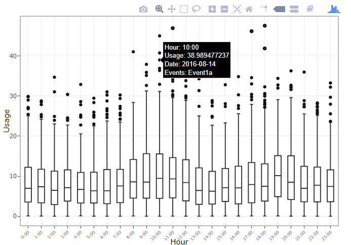
From there, we can easily produce hourly boxplots of usage. We can see there are several outlying points, and most usage occurs during the day as expected:
g <- ggplot(data = elec_hourly, aes(x = Hour, y = Usage, text = SDate)) +
         geom_boxplot() +
         geom_point(size = 0.3, alpha = 0) +
         theme_bw() +
         theme(axis.text.x = element_text(angle = 45, size = 6))
ggplotly(g)

We can also break this down by the day of the week in order to highlight the particular times of each day that usage is highest. Clearly sunday late mornings incur very high usage:
ggplotly(
    g + facet_wrap(~WeekDay, scales = "free_x")
)

However, often we are interested not in the overall trend, but in the anomalous points. For example, why did a particular Tuesday have extremely high usage at 6:00am?
It could have been due to a large gathering or a special event on the day. If we have a calendar listing of events that have taken place at each hour, how can we visualize and account for events on a time series chart like this?
Retrieving the Calendar Data
Many online calendar services all the exporting of events in a CSV format. However, one of the most popular ones, Google Calendar, exports only to an ICS file instead. Fortunately, with the help of GitHub user johnyluyte’s software ICS-to-Excel-CSV we can get the calendar events in a csv file. The live application is deployed at this URL. The page is in Chinese, but can be translated using any web browser. Once uploaded and converted, data in a format like below is given:
| # | Start | End | Title | Details |
|---|---|---|---|---|
| 1 | 20160111T201000Z | 20160111T213000Z | Event1a | EventDesc1a |
| 2 | 20160114T210000Z | 20160114T220000Z | Event1b | EventDesc1b |
| 3 | 20160118T180000Z | 20160118T190000Z | Event2a | EventDesc2a |
Cleaning the Calendar Data
We first must note the interesting structure of the Start and End columns. Information relating to the date and time of the event are combined, which means we need to do a little parsing in order to extract the relevant components. We use the very handy Lubridate package to make this a much simpler task:
## Parse the start dates
sample_calendar$Clean_Start <- ymd_hms(sample_calendar$Start)
# clean for all day events when no time given
sample_calendar$Clean_Start[is.na(sample_calendar$Clean_Start)] <- ymd(sample_calendar$Start[is.na(sample_calendar$Clean_Start)])

## Parse the end dates
sample_calendar$Clean_End <- ymd_hms(sample_calendar$End)
# clean for all day events when no time given
sample_calendar$Clean_End[is.na(sample_calendar$Clean_End)] <- ymd(sample_calendar$End[is.na(sample_calendar$Clean_End)])
The two cases handle both timed events, and all-day events. Next, we clean up the data using some dplyr routines. since we’d need to know the events that happened at every hour.
## Get the cleaned calendar
clean_calendar <- sample_calendar %>%
    select(Start = Clean_Start, End = Clean_End, Title) %>%
    mutate(Start_Hour = hour(Start),
           End_Hour = hour(End))

## Vectorized data sequence
seqdate2 <- function(from, to, by = "1 hour") { seq.POSIXt(from, to, by) }
seq2 <- Vectorize(seqdate2, vectorize.args = c("from", "to"), SIMPLIFY = FALSE)

## Store each hour an event took place
hour_seq <- clean_calendar %>%
              do(Hours = seq2(.$Start, .$End - seconds(1), by = "1 hour"))

## Make this data frame a bit prettier
clean_calendar_hours <- clean_calendar %>%
    mutate(Hours = unlist(hour_seq$Hours, recursive = FALSE))

## Get the final calendar hours
calendar_hours <- clean_calendar_hours %>%
    select(Title, Date = Hours) %>%
    mutate(Date = Date %>% map(function(y) tibble(Date = y))) %>%
    unnest() %>%
    group_by(Date) %>%
    summarise(Events = paste(Title, collapse = "<br>"))
Adding to Plot Tooltips
Now we are ready to combine the usage data with the calendar data and add to our plots. And we see that some of the during some of the most high usage hours there were certain events happening which could explain the usage.
hourly_elec_calendar <- elec_hourly %>%
    mutate(Date = ymd_hms(paste0(Date, " ", Hour, ":00"))) %>%
    left_join(calendar_hours) %>%
    mutate(Date = paste(SDate, paste0("Events: ", Events), sep = "<br>")) %>%
    select(Hour, Usage, Date, WeekDay, Month)

g <- ggplot(data = hourly_elec_calendar, aes(x = Hour, y = Usage, label = Date)) +
         geom_boxplot() +
         geom_point(size = 0.3, alpha = 0) +
         theme_bw() +
         theme(axis.text.x = element_text(angle = 45, size = 6))

ggplotly(g)

Leave a Reply
You must be logged in to post a comment.